BY JANIE KLIEVER
A photography instructor once told me that “You have to know the rules before you can break them.”
That’s the (simultaneously frustrating and freeing) thing about art and design — there may be some rules; there may be some best practices; but there are very few that are set in stone. Bending or breaking the rules is always a possibility in the right context. So how do we go about learning how to effectively combine fonts? By looking a few guidelines, we can see what has proven to work well as a starting point, then get comfortable moving beyond those basics if a design calls for it.
01. Choose complementary fonts
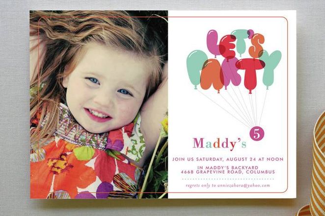
Many fonts have distinct moods or personalities — serious, casual, playful, elegant. You want to make sure the moods of your font choices match the purpose of your design. For instance, a rounded, bubbly typeface may be appropriate for a child’s birthday party invitation, but not for your business newsletter.
As is often the case with people, opposites tend to attract: “introverted” and “extroverted” fonts balance each other nicely when combined. So if you have a distinctive font with a “strong personality” (often referred to as a display font), pair it with something more neutral and conservative for a balanced design. The personal branding project below demonstrates this type of balance. The larger font has a lot of personality, with a curvy, hand-painted look (which complements the designer’s background as an illustrator and typographer). It’s set off by a simple, all-caps san-serif that doesn’t distract from the main font but is still legible at a smaller size.

Deciding whether two or more fonts complement each other can feel like something of a guessing game. You’ll often find yourself relying on instinct, a gut feeling. And that’s ok. If you make a point of noticing how fonts combine well (or not) out “in the wild” — on websites, in magazines, on store signs and product packaging — you’ll start to develop an eye for what works and what doesn’t.

02. Establish a visual hierarchy
Traditional publishing formats like newspapers and magazines offer good examples of how to apply a visual hierarchy to fonts. They combine fonts in way that visually separates different textual elements like headlines, sub-headlines, body copy, and captions. Qualities such as size, boldness (also known as “weight”), and spacing (including leading, the space between lines, and kerning, the space between letters) all contribute to how the eye should navigate the page and what text should attract attention first.
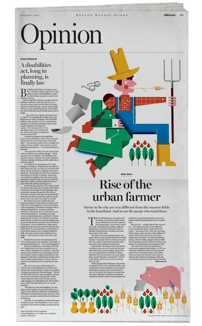
A hierarchy can be established for any type of design, not just layouts with titles and body copy. When you’re picking fonts for a project, just think about what part you want viewers to look at first. Or here’s another way of approaching it: Decide what information is essential — what must stand out at first glance (a company name, a headline, a special offer?) — and what is less important. Then, make your font style, size, and arrangement choices accordingly. The most important textual element is generally (though not always) the largest and the weightiest.
 03. Consider context
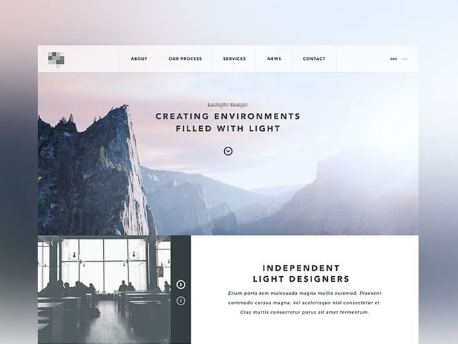
Where your design will appear should help you determine what fonts will work for your project. The text should be easily readable at the size it is going to be displayed, and clarity is especially important for small type. Notice how in the example below, the smallest text is in all caps, and the letters are spaced generously — both choices enhance legibility. 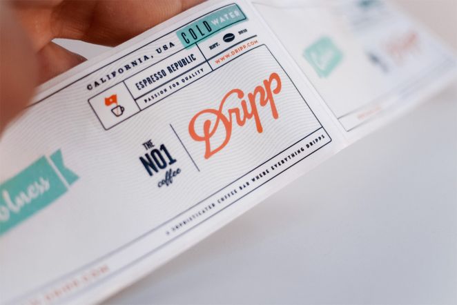
In addition to size, font styles also affect readability. A good starting point for choosing fonts that fit the context of your design is to match the attributes of your intended message with the perceived traits of a typeface (This ties back in with the font personalities discussed in Rule #1).
Part of the process will be deciding whether display typefaces or more neutral fonts (or some combination of the two) are most appropriate for your project. Sometimes you’ll want something that really pops, and other times the context will require a font that’s not distracting, such as for long passages of text. The magazine layout below combines two display typefaces with an easy-to-read sans serif for the body copy. 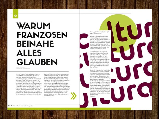
Context can also be approached in terms of genres and historical periods. Doing a little research into the backgrounds of the fonts you’re considering — when and how they were created and for what purpose, or even how they’ve been used in a cultural context — may help determine if they’re a good choice for your design. For instance, a book cover design for a biography about Abraham Lincoln might feature a stately serif font that was in use during the American Civil War era, such as Caslon or Clarendon.

As another example, font styles can play a big role in cementing the overall look of your design, especially if you’re going for a certain aesthetic. This design obviously has a retro/1950s theme, so the fonts have been chosen to reflect that context and are similar to those found in advertising and signage from the period. 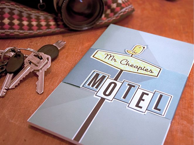
04. Mix serifs and sans serifs
Running short on time and need to pick two fonts, quick? Try one serif and one sans serif. The two tend to work together well, particularly at contrasting sizes.

It’s worth noting here that, in the world of typography, there’s an ongoing debate about whether serif or sans-serif fonts are best in terms of readability. For large amounts of text, serif fonts are generally thought to move the eye along more effectively and increase reading speed, especially in print (though this obviously depends the characteristics of the specific font used). On the other hand, sans-serif fonts are often favored for online/on-screen text due to their simplified letterforms that display more clearly at various screen resolutions.
05. Create contrast
One of the main reasons that pairing serif and sans-serif fonts works so well is that it creates contrast. This idea of contrast brings together multiple concepts that you should be considering, including hierarchy and how fonts complement each other.
Contrast can be achieved in a number of ways, including through style, size, weight, spacing, and color, among others. In the example below, a bold, chunky font is paired with a tall, thin one — and although they’re almost complete opposites, they work nicely together in large part because they are so different. The differences help create distinct roles for each font, allowing them to stand out as individual pieces of information. The size of the date (in pink) is about twice the height of the page title (in white), so those skinny numerals don’t get lost; their larger size gives them enough presence to stand up against the bold headline. 
06. Steer clear of conflict
When combining fonts, you do want contrast, but you don’t want conflict. Just because fonts are different doesn’t mean they will automatically work well together. Generally speaking, typefaces that share a couple qualities — maybe they have similar proportions, or the lowercase letters have the same height (known as “x-height”) — are more likely to look harmonious together, even if the overall appearance differs.
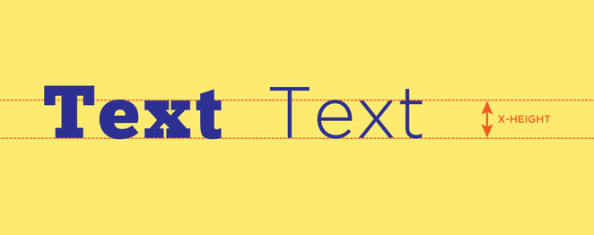
Take the pair of fonts below — this might be a situation where a serif and a sans-serif font are just a little too different from each other. The top typeface has very rounded, well-spaced letters, while the bottom one has taller, condensed letters. Add to that the contradiction between razor-thin serifs and a thick, uniform structure, and these two probably clash more than they contrast. 
07. Avoid pairing fonts that are too similar
On the flip side of Rule #5, choosing fonts that are too similar (i.e., don’t have enough contrast) becomes problematic. You’ll have trouble establishing a hierarchy, because the fonts aren’t visually distinguishable from each other. And any differences that are discernible may look more like a mistake than a purposeful choice.
But fonts don’t have to be exactly alike to be incompatible. Typefaces that are somewhat different but have comparable weights, proportions, and/or letter shapes may be similar enough to make your design look confusing and indistinct, especially when used at the same size — like the pair below, despite the fact that one has serifs and the other doesn’t. Here’s an easy way to test whether two or more fonts might be too similar: Place them side by side on your screen, then sit back a little and squint. If the fonts look basically the same, then that’s a good indication that your design could benefit from turning up the contrast between your type choices. 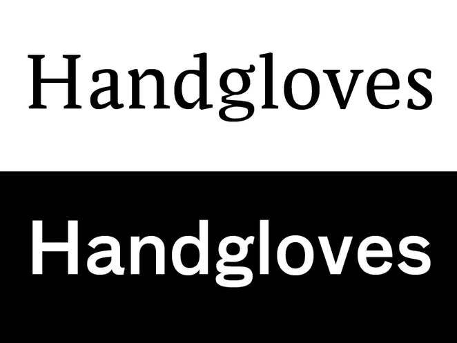
08. Use fonts from the same family
Using typefaces from the same family is always a safe bet; after all, they were created to work together. Look for families that come with a range of options (different weights, styles, cases) to ensure that you have enough variation for your purposes. 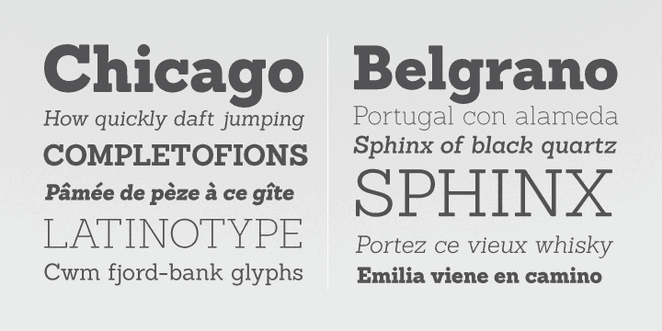
When pairing fonts that come from the same family, you have to plan carefully to create contrast, varying things like font size, weight (such as light, regular, and bold), and case (upper, lower, small caps). 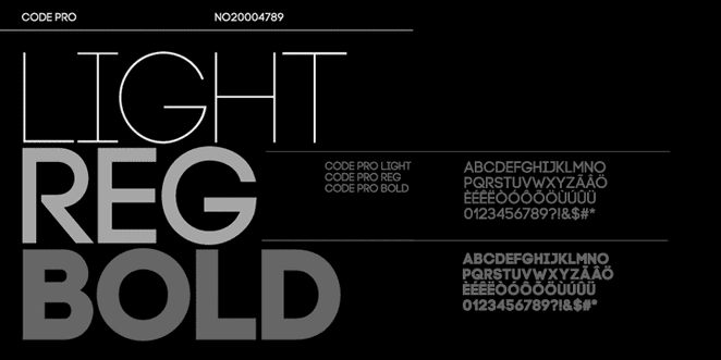
Families that come with extra features like italics or extended or condensed versions offer even more leeway for getting creative with your font arrangements.
One of the benefits of limiting your typefaces for a project to one font family is that it makes the design process a little more streamlined. It can be time-consuming trying to decide on the perfect fonts to combine, but when you have a predetermined selection already, it takes some of the pressure off and automatically helps you create a more cohesive look.
09. Limit your number of fonts
You may have heard it said that you should keep fonts for one project to only two or three. That’s an appropriate rule of thumb in certain applications (and is common in editorial designs like magazine spreads), but it is by no means a hard-and-fast rule. 
Some projects will call for more elaborate font combinations, such as if you’re replicating a certain look, like a fancy, Victorian-era design, or when you need a particularly decorative aesthetic. If you do choose to use a variety of fonts, the overall effect should be harmonious, not conflicting or cluttered. 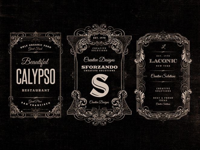
However, as with any design element, you can overdo it with typeface selections. Most projects will benefit from a more restrained, thoughtful approach. A good way to refine your choices is to give each font a specific role or purpose in the design. If you find yourself using an assortment of fonts, but you can’t really assign motives to your selections, then it may be time to cut back.
10. Practice!
Last but not least, a friendly suggestion rather than a rule: Practice combining fonts on your own, when there’s not money or your boss’ good opinion riding on the project. As with any skill, becoming competent involves a lot of trial-and-error. And as with most creative endeavors, the art of pairing fonts is often an objective one. There’s no foolproof formula for finding the perfect font combination.
So take risks. Experiment. Use your intuition. Sometimes you’ll just have a feeling that something works, even if it technically shouldn’t, according to the “rules.” Other times, you’ll just know that a font pairing isn’t working; try to figure out why and learn from it. Take these typography basics as a starting point, and if they serve you well, use them — if not, don’t let them stifle your creativity.

 03. Consider context


