

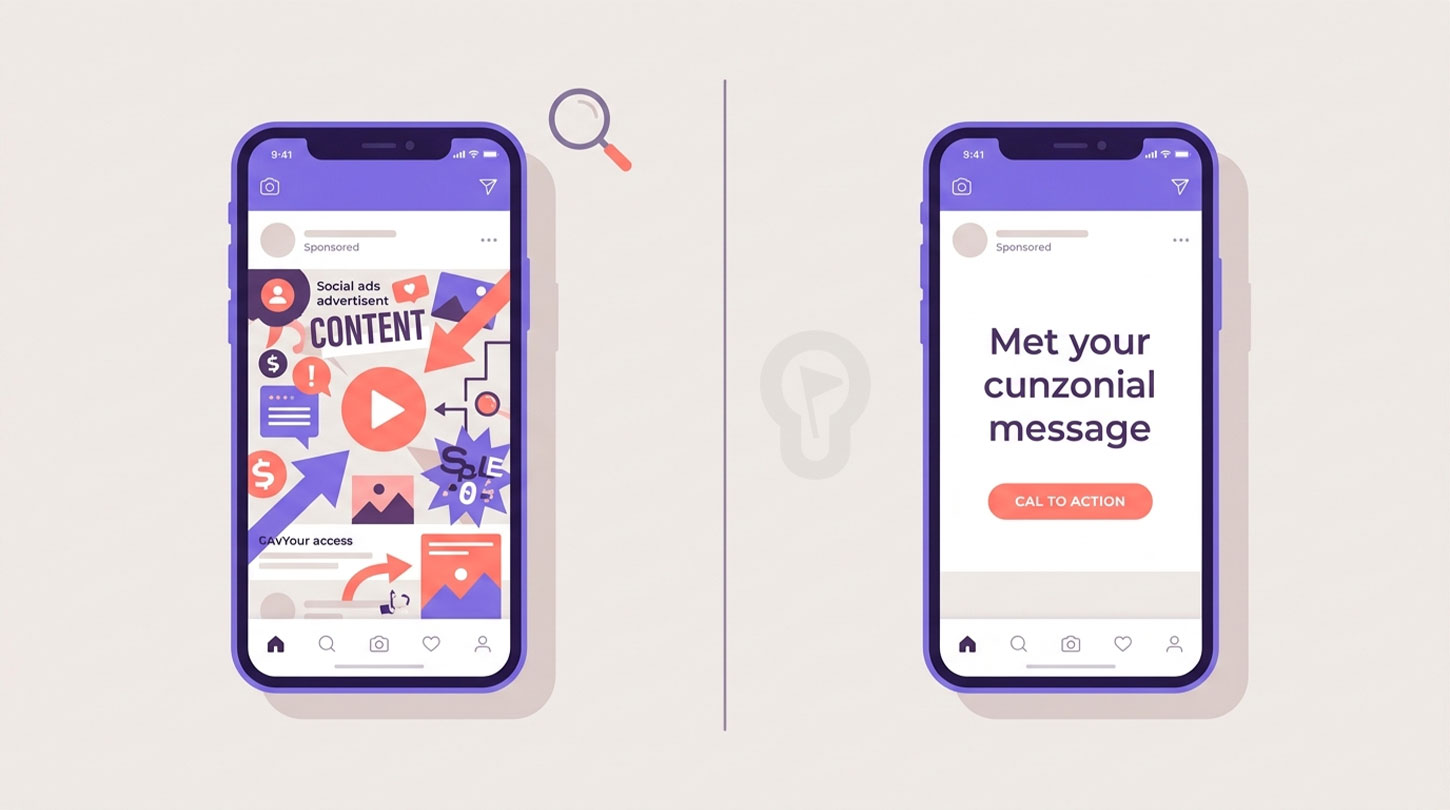
With the rise of “brilliant” AI designers, a large share of the ads circulating on social media today are dense: packed with data, icons, gradients, and even entire infographics squeezed into a single post. To someone untrained in graphic design, the result can look flawless. But there’s an uncomfortable question worth asking: beyond the personal taste of whoever created it, does that ad actually work?
dddddddSomeone once told me: “It’s not the one who wants to sing who sings, it’s the one who knows how to sing.” And this is exactly one of those cases. Designing an ad that converts isn’t a matter of taste, or of how many AI tools were used to build it — it’s a discipline with its own rules, as old as rhetoric itself.
As Aristotle put it, “We are what we repeatedly do. Excellence, then, is not an act, but a habit.” A good ad isn’t a lucky creative accident: it’s the result of applying, again and again, principles we already know work.
Let’s look, objectively, at what those principles are.
The most common mistake: confusing “creative” with “effective”
An ad can be a work of art and still sell absolutely nothing. It can have a brilliant infographic, twenty relevant data points, and a perfectly balanced color palette… and still go completely unnoticed in Instagram’s endless scroll.
Antoine de Saint-Exupéry summed it up better than any marketing manual ever could: “Perfection is achieved, not when there is nothing more to add, but when there is nothing left to take away.” In digital advertising, that’s not just a nice metaphor — it’s a performance metric. Every extra element in an ad is one more point where the user’s attention can leak away.
Why doesn’t anyone read the fine print (but they’ll read the caption)?
Here’s the key point almost nobody explains: user behavior on Instagram isn’t linear, it’s hierarchical.
Very rarely does someone stop to read tiny text inside an image, zooming in on the post to make it out (if they even try). But that same person will happily stop to read a longer, more complex text in the ad’s caption — as long as something in the image first caught their attention: a color, a face, a clear promise.
This isn’t random; it’s the architecture of attention. The image’s job is to stop the thumb; the copy’s job is to convince the person who already stopped. Asking the image to do both at once is, almost always, asking it to do neither one well.
As Seneca warned, “It is not that we have a short time to live, but that we waste a lot of it.” Instagram users don’t have a short attention span — they have a lot of competition for that span. An ad crammed with information demands a reading effort they simply aren’t willing to make in exchange for nothing.
Table: characteristics of a truly effective ad
| Characteristic | Type | Why it works |
|---|---|---|
| One single core message | Technical / Emotional | The brain processes one idea better than ten. If an ad competes with itself to communicate several ideas at once, none of them wins, and the user keeps scrolling. |
| Clear visual hierarchy | Technical / Aesthetic | The eye needs an obvious entry point (size, contrast, position). Without hierarchy, the user doesn’t know where to look first and moves on in under a second. |
| White space (breathing room) | Aesthetic | Empty space isn’t wasted space — it’s a tool. It directs the gaze toward what matters and signals perceived quality before a single word is even read. |
| Short copy on the visual, detail in the caption | Technical / Emotional | The image should generate the “stop”; the longer text belongs where the user has already chosen to invest time — the caption, not the graphic. |
| Intentional color contrast | Technical | Contrast — not the number of colors — is what separates the message from the visual noise of the feed. More colors doesn’t mean more attention; it means more internal competition. |
| “Thumb-readable” typography | Technical | Most content is viewed on small screens, in motion, without zooming. If the text can’t be read in two seconds without zooming in, it never gets read at all. |
| An explicit call to action (CTA) | Technical / Emotional | Ambiguity paralyzes. Telling the user exactly what to do next reduces the friction between interest and action. |
| A genuine human face or movement | Emotional | We’re biologically wired to stop at faces and gestures. It’s one of the few certainties in persuasive design that neuroscience confirms over and over. |
| Authenticity / native format | Emotional / Aesthetic | An ad that looks like agency advertising triggers instinctive rejection. One that looks like the platform’s own organic content builds trust and lowers the user’s guard. |
| Social proof or credible specificity | Emotional | A concrete detail (“500+ customers,” “in 48 hours”) builds more trust than ten adjectives (“the best,” “amazing,” “unique”). |
| Brand consistency | Technical / Emotional | Constant visual repetition is what builds long-term recognition, even when the user doesn’t interact with that particular ad. |
Creativity isn’t the problem — excess is
Just because an ad is creative and includes all the text you feel you “need” to say doesn’t mean, in any way, that it will go viral. Virality and conversion both come down to cognitive friction: how much mental effort you’re asking the user to spend before they understand what you’re offering.
Marshall McLuhan argued that “the medium is the message.” Instagram, as a medium, has its own language: fast, visual, intimate, mostly consumed with a thumb in fractions of a second. An ad that ignores that language — no matter how complete, informative, or “professional” it looks on a desktop monitor — is, in practice, speaking to the user in a dialect they don’t recognize as native to the place where they’re standing.
The underlying lesson is this: design isn’t there to show off, it’s there to communicate. And communicating well, almost always, means saying less, not more.
So, what’s your weak spot?
We want to hear from you: out of everything on that list, which characteristic do you think matters most for an ad to actually work? Which one do you feel your own posts are missing? And which one is your strongest asset?
Tell us in the comments — we’d love to read your take and put together a follow-up piece featuring the most interesting responses.
And if reading this made you realize your brand materials need to make that jump from “creative” to “effective,” at Ideas Fan we have a design team ready to help — from business cards to the rest of your promotional materials. Get in touch with us and let’s talk about your project.