
Just a few hours ago I received a message that pushed me to write this down immediately. A young plumbing business owner in Toronto — sharp, successful, with a clear vision for his brand — sent me an image for his logo. A swirling whirlpool of water, complex and magnetic, wrapping around his company name in bold lettering, full of shine and effects worthy of a highway billboard.
He had asked an AI to create it. And the result, admittedly, was beautiful.
But that’s exactly the problem. When we ask an AI to design our logo, we almost never give it the right or complete parameters. We say something like: “I want a red and blue logo for my plumbing company called Plumber’s Pro,” and the machine delivers something stunning. Powerful. Exactly in the colors requested. But is this actually a good logo?
After more than 30 years in this craft, my answer is no.
What Socrates already knew about design
Socrates said the secret of change is to focus all your energy not on fighting the old, but on building the new. And building a new logo starts with understanding what makes it work, not with piling on everything that looks appealing.
The essential characteristics of a professional logo are clear:
- Simplicity. A clean design, free of unnecessary ornamentation, is easier to read and remember. Leonardo da Vinci put it best: simplicity is the ultimate sophistication.
- Versatility and scalability. It must work equally well as a tiny favicon and as a massive highway billboard, without losing a single detail of its identity.
- Timelessness. A good design isn’t afraid of passing trends. It stays relevant twenty, thirty, fifty years later.
- Memorability. It must lodge itself in the consumer’s mind from the very first glance.
- Relevance. The style, color, and typography must speak the language of the industry and the audience the brand serves.
- Distinctiveness. Here’s one I’ll add myself: a logo shouldn’t just be recognizable, it should be unmistakable. If you cover up the brand name and people still know it’s you, you’ve achieved something no visual effect can buy.
Back to the water whirlpool
The logo my client received isn’t simple. It has so much detail you can almost feel the foam forming in each spiral. It’s eye-catching, sure, but shrink it down and it loses exactly what made it special. In practice, it’s impossible to use as a favicon.
Is it timeless? Maybe. But I doubt anyone could recall it precisely enough to redraw it after seeing it for three minutes. It might be recognizable, but it doesn’t stick. And a logo that doesn’t stick fails at its most basic job.
Is it relevant to the industry? Absolutely. After all, we asked for colors associated with plumbing. But relevance without memorability is just a pretty picture, not a brand.
Antoine de Saint-Exupéry wrote that perfection is achieved not when there is nothing left to add, but when there is nothing left to take away. That’s exactly the work still missing from this logo.
AI doesn’t read your business, it reads your words
AI systems are built to respond with empathy to what you ask, not to what you actually need. If you leave out key design information — whether out of inexperience or personal taste — the result will be something you like, but not necessarily something that projects professionalism or authority to your customers.
There’s something else many people overlook: that result is always just an image. Never a vector file. Not even a PNG with a transparent background. You’ll have to fix that afterward, in a design program, with human hands that understand strokes, curves, and reproduction at scale.
That’s why, in this case, I asked the same AI for a minimalist version: no gradients, no excess detail, able to reproduce on any material without losing its identity. The result improved noticeably. But it can still be refined further.
Marshall McLuhan said the medium is the message. I’d add: in branding, the form is also the message. A logo isn’t a literal photograph of your business. It’s a conceptual identifier, an idea distilled to its purest expression.
The takeaway every business owner needs to hear
A great logo isn’t born from asking a machine to draw something pretty. It’s born from knowing exactly what you’re asking for, and why. AI is an extraordinary tool, but strategy, judgment, and experience are still deeply human.
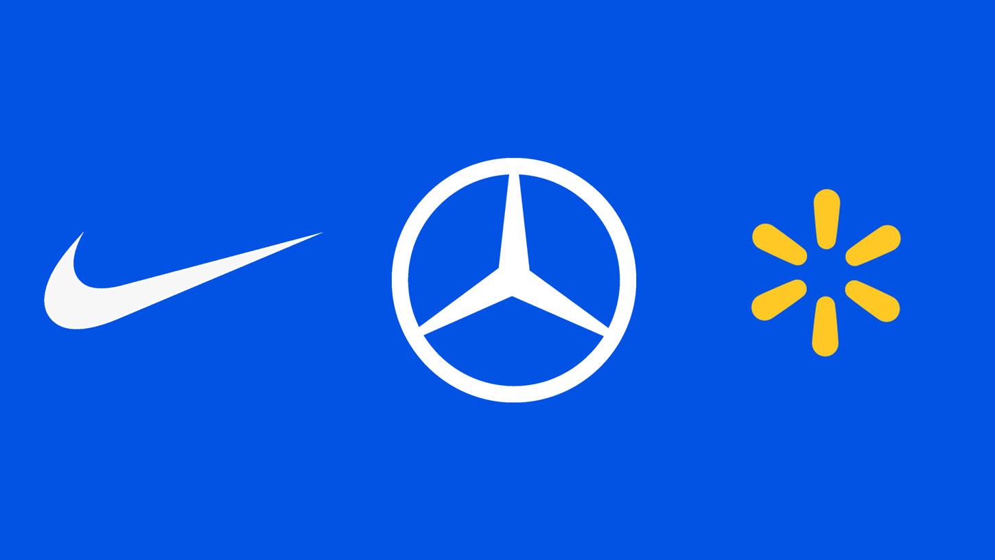
P.S. A common pattern is that people without experience or guidance tend to include literal elements that depict what the business does. This isn’t correct. The full explanation deserves its own blog post, but here’s a preview: Where are the shoes or the jerseys in Nike’s logo? Where’s the car in the Mercedes logo? Where are the boxes and merchandise in Walmart’s logo? Or where’s the symbol for the brutal censorship YouTube exercises over everything content creators make? (In case you missed it, that last one is a joke — not because YouTube doesn’t censor, but because, well, it’s a video platform.)
If you want to refresh your brand image or create a new one, contact us today.