The logo is the face of your company, the first visual point of contact your customers have with your brand. Over time, your business grows, the market evolves, and design trends change, which means your logo must stay up to date-to reflect all of these aspects. Changing a company logo every seven years is not only a visual renewal strategy but a powerful way to better connect with your audience, compete in the global market, and ensure the relevance of your brand. Here’s why.
1. Cultural and generational changes
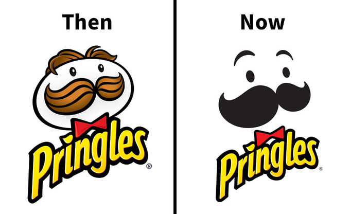
Each generation brings new values, tastes and ways of interacting with brands. A logo that was relevant a decade ago might seem outdated today. Staying in tune with emerging generations is essential to maintaining an emotional connection with consumers, especially younger ones, who are more likely to reject brands that don’t fit their culture. Changing your logo allows your company to reflect these changes and stay aligned with new cultural demands.
2. Nostalgia Marketing
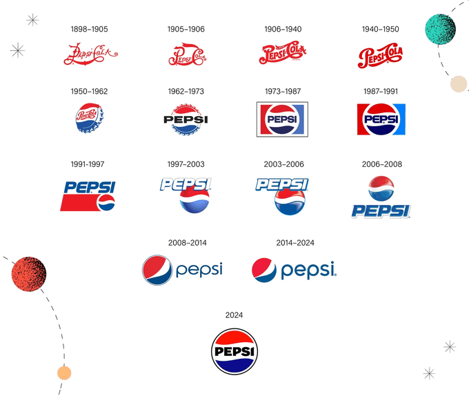
“nostalgia marketing” has become a mighty trend. You can nod to the past by redesigning your logo while projecting yourself into the future. Brands like Coca-Cola or Apple have mastered this technique, using minimalist designs that evoke their old logos to connect with their audience emotionally. This type of marketing allows you to attract both old and new customers, combining familiarity and modernity.
3. Brand Loyalty
Brand loyalty is not just about a logo. If you have built a solid relationship with your customers, a logo change will not be a threat but a sign of evolution. A strategic redesign can reinforce that loyalty, showing that your company is constantly renewing itself, which creates a feeling of freshness and dynamism.
4. Minimalist designs for global markets
In an increasingly competitive global market, complex or over-the-top designs are at a disadvantage compared to minimalist logos, which are easier to recognize and remember. A simple design has a more significant visual impact and is more versatile, allowing it to work effectively in any market or cultural context.
5. Elegance in design
Elegance in logo design is not just about aesthetics; it also reflects the essence and values of your brand. A redesign that seeks simplicity and elegance can position your company as sophisticated and professional. This is especially important to attract a high-profile or international audience.
6. Recognition in small icons
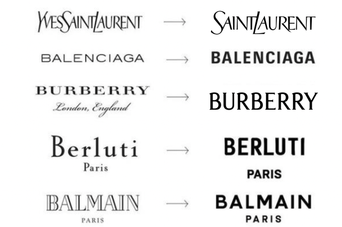
Technological advances have reduced the size of the spaces where a logo must appear. In the digital world, your logo must be recognizable even in tiny formats, such as the 38×38 pixel icons on the Apple Watch. If your current logo doesn’t scale well to these sizes, it’s time to redesign it, ensuring it’s functional and attractive on any device or platform. The concept of a responsive logo echoes this new need, as your logo’s application must adapt very effectively to different formats, spaces, textures, and contrasts without losing its value.
7. Avoid boring logos
A boring logo is synonymous with a static brand. If your logo doesn’t generate curiosity or interest, your brand probably won’t either. Today, consumers are exposed to thousands of images daily, so a logo must be bright and vibrant to stand out. Avoiding generic and fresh branding is critical to staying competitive in the market.
8. Brand positioning
A logo redesign can be the perfect boost to reposition your brand. If your company has changed its focus, expanded its products or services, or reached new markets, an updated logo can be the visual signal that communicates this new chapter of your business.
9. Avoid confusing logos
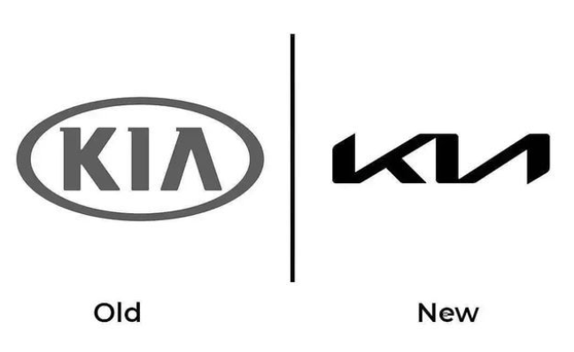
A logo should be clear and easy to interpret. Confusing or complicated designs create barriers for the customer to quickly and effectively understand your brand. If your logo doesn’t convey what your company stands for or causes confusion in the market, it’s time to redesign it to prevent ambiguity from affecting your reputation.
10. Breaking away from old identities
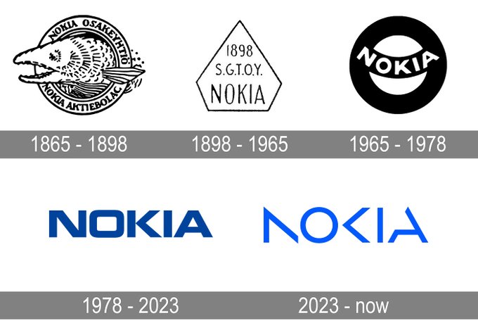
Some companies fear breaking their historical identity for fear of losing their connection with their customers. However, clinging to an old identity can be more harmful than beneficial. Brands that thrive know when it’s time to reinvent themselves. Breaking with an outdated identity shows that your company is ready for the future and positions you as innovative and constantly growing.
11. You won’t lose your customers
One of the biggest fears of small businesses when changing their logo is that their customers will not recognize them. This is a myth. If the logo change is well planned and communicated, your customers will remain emotionally connected to your brand. A redesigned logo is an excellent opportunity to make a marketing campaign that celebrates your brand’s evolution, strengthening the bond with your audience.
12. Conclusion: The evolution of your image is in the hands of Ideas Fan
At Ideas Fan, we understand the importance of keeping a brand image fresh and relevant. As branding experts, they’ll accompany you through every step of redesigning your logo, ensuring that the change reflects the essence of your business, attracts new customers, and keeps existing ones loyal. We live in a changing, informed and connected world, and your logo must evolve. Check out how to renew your brand image and grow in today’s global market.

